Différences entre versions de « SBK-Spreadsheet »
| Ligne 45 : | Ligne 45 : | ||
Then with the Control key held down, click on the column header to be added to the chart (in the following capture this concerns the column D & E). | Then with the Control key held down, click on the column header to be added to the chart (in the following capture this concerns the column D & E). | ||
| + | [[fichier:SBK-Spreadsheet-50.png]] | ||
| − | [[fichier:SBK-Spreadsheet- | + | Then selects the menu entry "Insert | Chart..." |
| + | |||
| + | [[fichier:SBK-Spreadsheet-51.png]] | ||
| + | |||
| + | Which displays the chart option dialog | ||
| + | |||
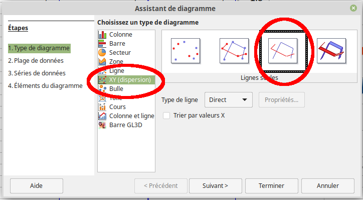
| + | [[fichier:SBK-Spreadsheet-52.png]] | ||
{{SBK-TRAILER}} | {{SBK-TRAILER}} | ||
Version du 5 juillet 2024 à 22:18
Forewords
The SBK Datalogger does record data under the CSV format namely, a coma-separated value content see more on wikipedia).
Once the recorded CSV file available on your computer, the data it contains can be loaded and manipulated into a spreadsheet software.
Loading the CSV file
Most of the countries do use dot as decimal separator. If it's your case then CSV file would be immediately loaded into the spreadsheet software.
Such regional settings are not compatible with the common CSV format using coma as field separator and dot as decimal separator.
Loading in LibreOffice Calc
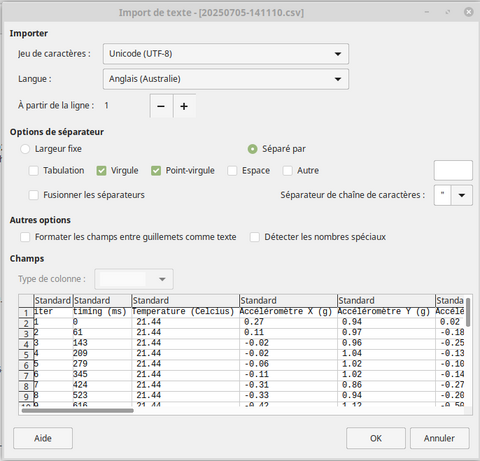
Double clicking the CSV file do starts the spreadsheet software which then displays the "import" configuration window.
Selects:
- Use UTF-8 character set
- Select a "langage source" using the dot as decimal separator will helps a lot (eg: English based langage).
- Select "coma" and "semi-colon" as field separator
- Select "double-quotes" as string separator.
The preview show data as they will be imported into the spreadsheet.
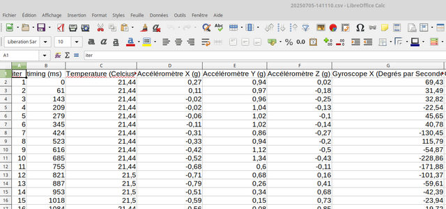
Press the OK button to load the data.
Voila! The data is available for any further treatment
Graph the data
Importing the data into the spreadsheet is a great way to do some math on it.
For sure, the most interesting task is to explore the data draw into a chart.
Charts with LibreOffice
The spreadsheet graphic tools can display a chart of single or multiple collection(s) of data.
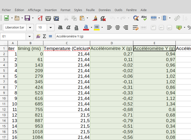
To do so, select the "timing" column by clicking onto the columns header.
Then with the Control key held down, click on the column header to be added to the chart (in the following capture this concerns the column D & E).
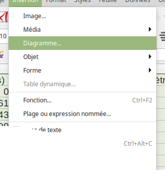
Then selects the menu entry "Insert | Chart..."
Which displays the chart option dialog
Written by Meurisse D. for MCHobby
